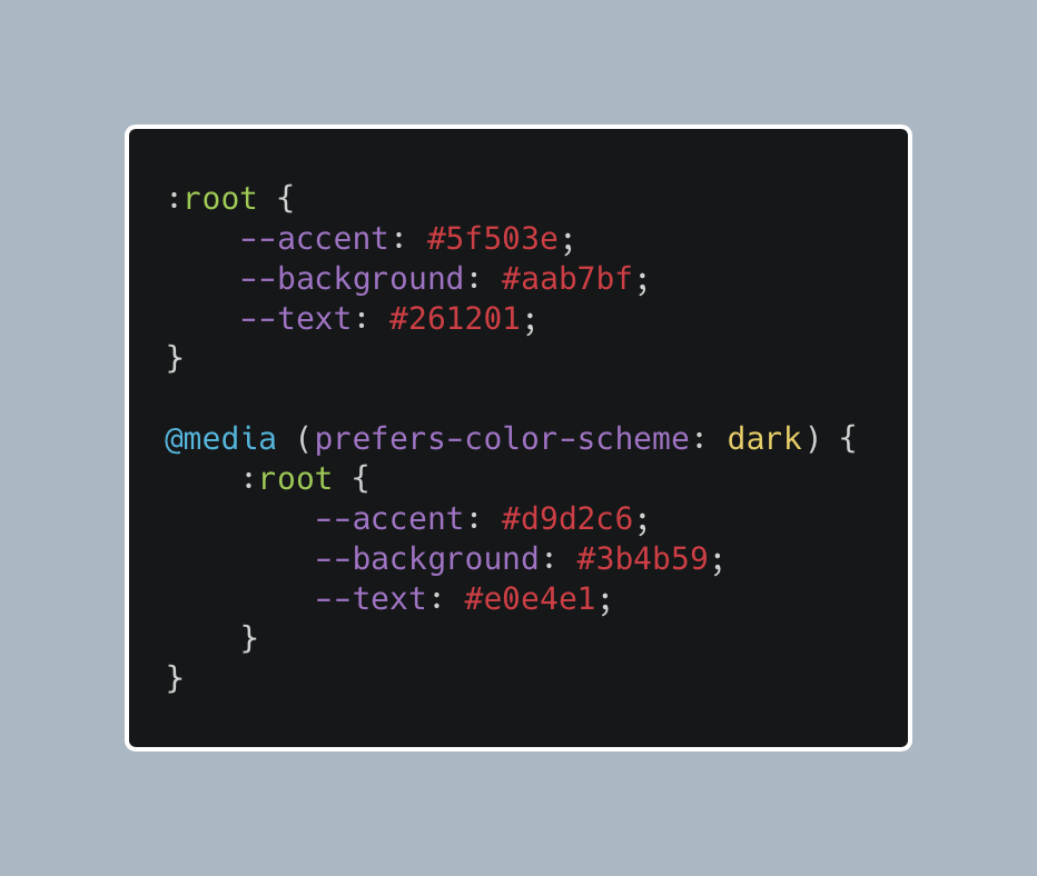
When designing this blog, I wanted to keep things simple, working on the principle that improvement does not always mean adding things. I knew I didn't want a dark/light mode button or toggle, but I like the idea of a light and dark mode for a website. Instead of a toggle, this site shows a light or dark variation based on the user’s device preference for the colour scheme. This is achieved by using:
@media (prefers-color-scheme: dark)
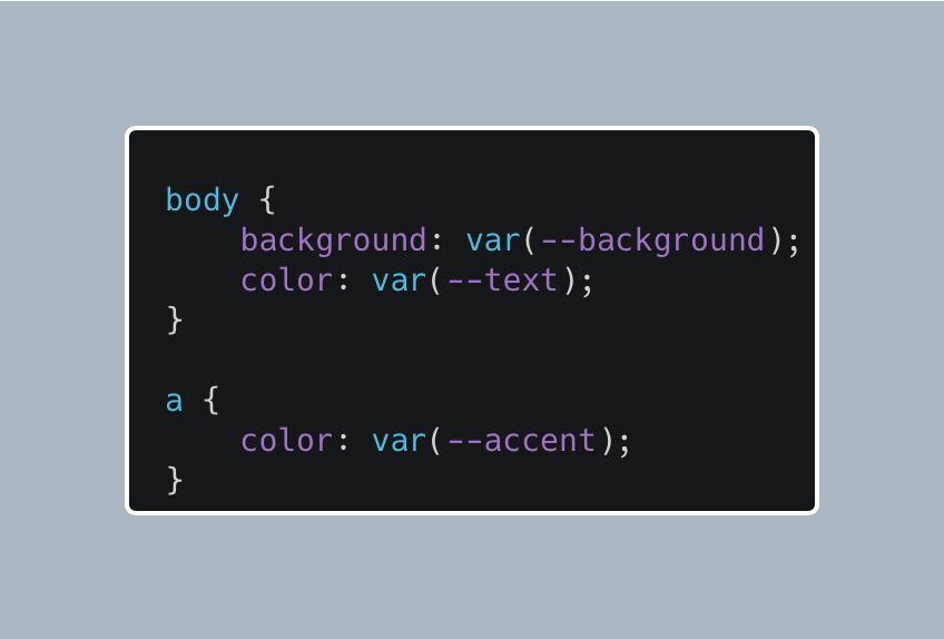
In my CSS, I set up a color variable for the background colour, text colour and link colour. The default is the light mode, and then when the media query detects that the user prefers a dark colour scheme, it changes the value of the variable to the dark mode colours.
Using the colour variable in CSS allows me to set the background, text and link colours for any element like this example.
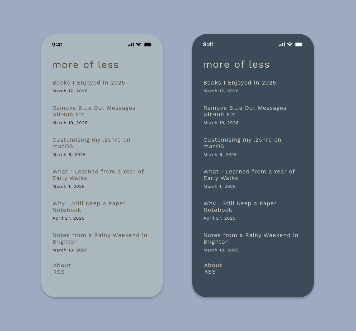
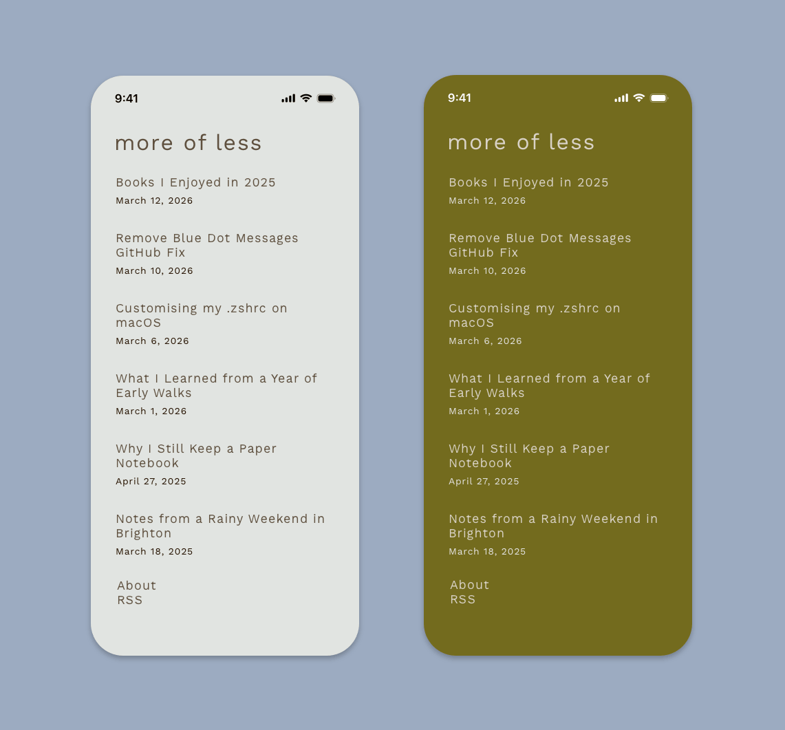
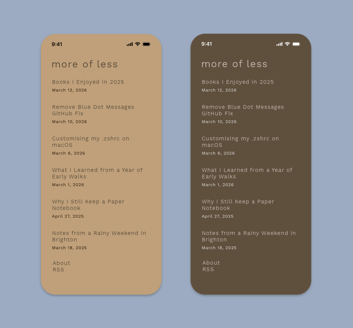
I created four themes for the blog, each has its own light and dark mode. Here are the themes I designed and my favourite colour is Oxford Blue.
Himalaya
Kabul
Nero
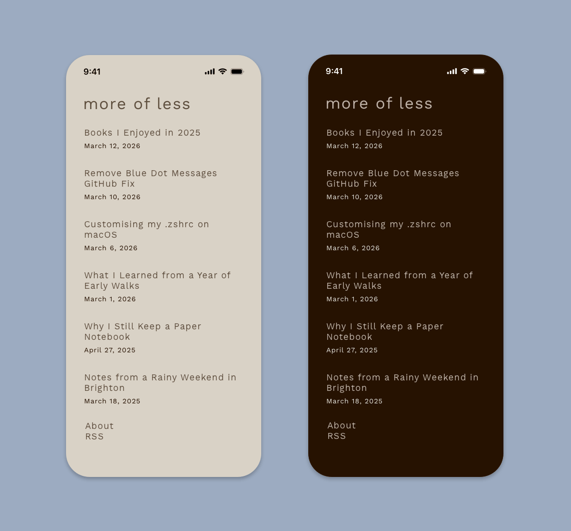
Oxford Blue